In today’s digital landscape, having a well-designed website is crucial for businesses to stay competitive and attract customers. One approach that has gained significant attention and recognition is responsive web design. Responsive web design refers to creating a website that adapts to different screen sizes and devices, providing a seamless experience for users across all platforms. In addition to its user-friendly nature, responsive web design also brings a range of SEO advantages. In this article, we will explore the concept of responsive web design and delve into the specific benefits it offers for search engine optimization.
Understanding the Concept of Responsive Web Design
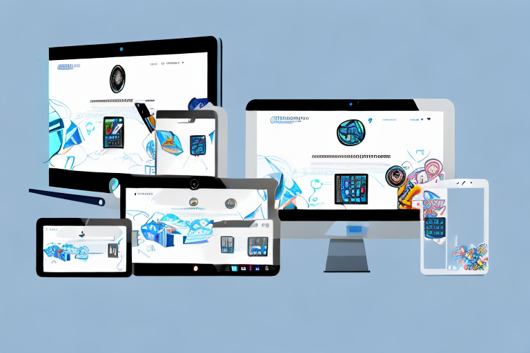
Before diving into the SEO advantages, it is essential to have a clear understanding of what responsive web design entails. Responsive web design uses CSS media queries to adjust the layout and content of a website based on the device being used to access it. This means that regardless of whether a user is accessing the website from a desktop computer, a tablet, or a mobile phone, the website will automatically adapt to provide an optimal viewing experience. By utilizing flexible grids, images, and CSS styling, responsive web design ensures that websites are visually appealing and easy to navigate on any device.
Responsive web design has become increasingly important in today’s digital landscape. With the rise of mobile devices and the ever-growing number of people accessing the internet on the go, it is crucial for websites to be accessible and user-friendly across various devices. Gone are the days when websites were designed solely for desktop computers. Now, users expect websites to seamlessly transition from one device to another, without compromising on functionality or aesthetics.
One of the key features of responsive web design is its ability to adapt to different screen sizes. This means that whether a user is viewing a website on a large desktop monitor or a small smartphone screen, the content will automatically adjust to fit the available space. This ensures that users do not have to zoom in or scroll horizontally to view the entire website, making for a much more enjoyable browsing experience.
Another important aspect of responsive web design is the use of flexible grids. Instead of using fixed pixel values for layout, responsive websites use relative units such as percentages or ems. This allows the website to adapt to different screen sizes and resolutions, ensuring that the content remains readable and visually appealing. By using flexible grids, designers can create websites that look great on any device, without the need for separate mobile versions or device-specific layouts.
In addition to flexible grids, responsive web design also makes use of flexible images. Images are an integral part of any website, but they can pose a challenge when it comes to responsive design. If images are not properly optimized for different screen sizes, they can slow down the loading time of a website and negatively impact the user experience. Responsive web design addresses this issue by using CSS techniques to ensure that images scale proportionally and maintain their aspect ratio across different devices. This means that images will always look their best, regardless of the screen size or resolution.
Overall, responsive web design is a crucial aspect of modern web development. It allows websites to adapt to the ever-changing digital landscape and ensures that users can access and enjoy content on any device. By using CSS media queries, flexible grids, and optimized images, responsive web design creates a seamless browsing experience that is both visually appealing and user-friendly. So next time you visit a website on your smartphone or tablet, take a moment to appreciate the thought and effort that went into making it responsive.
The Importance of Having a Responsive Website
In today’s mobile-driven world, having a responsive website is no longer just a luxury but a necessity. With the increasing number of people accessing the internet through mobile devices, having a website that is mobile-friendly is essential for capturing and retaining visitors. A responsive website ensures that users can easily navigate and interact with the content, regardless of the device they are using. This translates to a better user experience, increased engagement, and higher chances of conversion. Moreover, search engines like Google prioritize websites that are mobile-friendly, making responsive web design a crucial factor in achieving a higher ranking in search engine results pages (SERPs).
Let’s delve deeper into the reasons why having a responsive website is so important. Firstly, a responsive website allows your content to adapt to different screen sizes. This means that whether a user is browsing your website on a large desktop monitor or a small smartphone screen, the content will automatically adjust to fit the screen perfectly. This eliminates the need for users to zoom in or scroll horizontally, providing them with a seamless browsing experience.
Secondly, a responsive website ensures that your website’s design and layout remain consistent across different devices. This is crucial for maintaining your brand identity and providing a cohesive user experience. Imagine if your website looked completely different on a mobile device compared to a desktop. It would confuse and frustrate users, leading to a higher bounce rate and a negative perception of your brand.
Furthermore, a responsive website improves your website’s loading speed. Mobile users, in particular, have little patience for slow-loading websites. If your website takes too long to load on a mobile device, users are more likely to abandon it and move on to a competitor’s website. By optimizing your website for mobile devices, you can ensure that it loads quickly and efficiently, keeping users engaged and reducing bounce rates.
Another benefit of having a responsive website is improved search engine optimization (SEO). As mentioned earlier, search engines like Google prioritize mobile-friendly websites in their search results. This means that having a responsive website can give you a competitive edge and increase your chances of ranking higher in SERPs. Additionally, a responsive website makes it easier for search engine crawlers to index your content, improving your website’s visibility and discoverability.
Lastly, having a responsive website future-proofs your online presence. As technology continues to evolve, new devices with varying screen sizes will emerge. By investing in a responsive website now, you can ensure that your website remains accessible and user-friendly on future devices. This saves you from the hassle and cost of redesigning your website every time a new device hits the market.
In conclusion, having a responsive website is crucial in today’s mobile-driven world. It not only provides a better user experience but also improves your chances of capturing and retaining visitors, increasing engagement, and boosting conversion rates. Moreover, a responsive website is favored by search engines, leading to higher rankings in SERPs. So, if you haven’t already, it’s time to make your website responsive and stay ahead of the competition.
Unlocking the SEO Advantages of Responsive Web Design
Now that we have established the importance of responsive web design, let’s dive into how it can benefit your website’s SEO efforts.
Enhancing User Experience with Responsive Design
One of the key factors that search engines consider when determining rankings is user experience. A responsive website provides a seamless experience, regardless of the device or screen size, resulting in higher user satisfaction.
Imagine you are browsing the internet on your smartphone and come across a website that is not optimized for mobile. The text is too small to read, the buttons are too close together, and you have to constantly zoom in and out to navigate. Frustrating, right? Now imagine the opposite scenario – a website that adjusts perfectly to your screen size, with clear and readable text, and easy-to-tap buttons. Which one would you prefer?
When visitors have a positive experience on your website, they are more likely to stay longer, explore more pages, and engage with your content. This reduces bounce rates and demonstrates to search engines that your website is valuable and relevant to users, thereby improving your chances of ranking higher in SERPs.
Mobile-First Approach: Google’s Preference for Responsive Websites
With the majority of internet searches happening on mobile devices, Google has taken a mobile-first approach to indexing websites. This means that Google primarily crawls and indexes the mobile version of a website, making it crucial for websites to have a responsive design.
Think about how often you use your smartphone to search for information, products, or services. It’s convenient, right? Google recognizes this shift in user behavior and wants to provide the best possible search experience for mobile users. Having a responsive website ensures that your content is accessible to Google’s mobile crawler, improving your chances of being properly indexed and ranked in search results.
Boosting Customer Satisfaction through Responsive Design
Satisfied customers are more likely to become repeat visitors and advocates for your brand. A responsive website that delivers a consistent and user-friendly experience across devices helps to build trust and loyalty with your audience.
Imagine you are shopping online and find a website that is not responsive. The images are distorted, the text is overlapping, and it’s difficult to navigate. Would you trust this website with your credit card information? Probably not. On the other hand, a responsive website that adapts seamlessly to your device instills confidence and makes the shopping experience enjoyable.
When users can easily access and navigate your website regardless of the device they are using, they are more likely to engage with your content, make purchases, or contact your business. This positive experience translates to higher customer satisfaction, which can ultimately lead to positive reviews, referrals, and improved rankings in search engines.
Decreasing Bounce Rates with Responsive Web Design
Bounce rate refers to the percentage of visitors who leave your website after viewing only one page. A high bounce rate indicates that visitors did not find your website engaging or relevant to their needs. A responsive design helps to reduce bounce rates by providing an optimal viewing experience for users.
Imagine you click on a search result and land on a website that takes forever to load, has tiny text, and is difficult to navigate. Chances are, you’ll hit the back button and look for a better website. However, if the website is responsive, loads quickly, and provides a seamless browsing experience, you’ll be more inclined to explore further.
When visitors can easily navigate and consume your content, they are more likely to explore additional pages, increasing the time spent on your website and reducing bounce rates. This positive user behavior signals search engines that your website is valuable and informative, potentially improving your rankings.
Speeding Up Your Website with Responsive Design
Website loading speed is a crucial factor in both user experience and SEO. Slow-loading websites not only frustrate users but also rank lower in search results. With responsive web design, you can optimize your website’s loading speed.
Imagine waiting for a website to load and it takes forever. Frustrating, right? In today’s fast-paced world, users expect websites to load quickly. Responsive design allows you to optimize your website’s performance by using flexible grids and images that are appropriately sized and displayed. This reduces the need for excessive scrolling or zooming, resulting in faster loading times.
This optimized loading speed not only enhances the user experience but also improves search engine rankings. Search engines prioritize websites that provide a fast and seamless browsing experience, so by implementing responsive design, you are giving your website an advantage in the competitive world of SEO.
Eliminating Duplicate Content with Responsive Web Design
Prior to responsive web design, some businesses created multiple versions of their website to cater to different devices. This approach often resulted in duplicate content across these versions. Duplicate content can confuse search engines and dilute the visibility of your website in search results.
Imagine searching for a specific topic and finding multiple websites with the exact same content. It’s frustrating and makes it difficult to find the most relevant information. Responsive web design eliminates the need for multiple versions, ensuring that your website content remains consistent, no matter how it is accessed.
This avoids any penalties associated with duplicate content and allows search engines to properly crawl and index your website, leading to improved rankings.
In conclusion, responsive web design offers numerous SEO advantages that can significantly impact your website’s visibility and rankings in search results. By providing an optimal user experience, ensuring mobile compatibility, boosting customer satisfaction, reducing bounce rates, speeding up website loading, and eliminating duplicate content, responsive web design enhances both user engagement and search engine visibility.
So, if you haven’t embraced responsive web design yet, now is the perfect time to do so and harness its potential for driving organic traffic and improving your online presence.