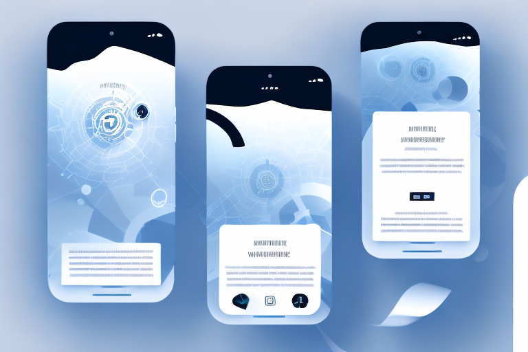
In today’s digital world, having a website that is mobile-friendly is essential. With more and more users accessing the internet through their smartphones and tablets, it is crucial that your website performs well on mobile devices. In this article, we will explore seven tips to optimize your website for mobile devices, helping you reach a wider audience and improve user experience.
Boost Your Website’s Mobile Performance
With mobile devices becoming the primary way people access the internet, it is essential to prioritize the performance of your website on these devices. Slow-loading pages can lead to a frustrating user experience and higher bounce rates. To optimize your website’s mobile performance, focus on the following:
The Importance of Mobile-Friendly Websites
In today’s fast-paced world, users expect websites to load quickly and display correctly on their mobile devices. A mobile-friendly website is not just an option; it is a necessity. With Google’s mobile-first indexing, having a mobile-friendly website is crucial for search engine optimization (SEO) and ranking higher in search results.
When it comes to mobile-friendly websites, there are several factors to consider. Firstly, responsive design is key. This means that your website should adapt and adjust its layout to fit different screen sizes and resolutions. By doing so, you ensure that your content is easily readable and accessible, regardless of the device being used.
Another important aspect of mobile-friendly websites is touch-friendly navigation. Mobile users interact with websites using their fingers, so it is vital to have large, easily clickable buttons and links. This enhances the user experience and reduces frustration when navigating through your site.
Furthermore, optimizing your website for mobile devices involves considering the loading speed of your pages. Users on mobile devices often have limited bandwidth and slower internet connections, so it is crucial to minimize the time it takes for your website to load. This leads us to our next point:
Speed Matters: Optimizing Mobile Content Load Time
One of the primary factors that can impact your website’s mobile performance is the load time of your content. Users are impatient, and if your pages take too long to load, they are likely to leave and never return. To optimize your mobile content load time, consider the following:
- Compress and optimize images: Large images can significantly slow down your website. Compressing and optimizing images for mobile devices can help improve load times.
- Minify CSS and JavaScript files: Remove unnecessary spaces and comments from your CSS and JavaScript files to reduce file sizes and improve load times.
- Implement lazy loading: Lazy loading is a technique that delays the loading of non-visible content until the user scrolls to it. This can improve initial load times and reduce data usage.
Images are an essential part of any website, but they can also be a major contributor to slow loading times. To ensure that your website performs well on mobile devices, it is crucial to compress and optimize your images. This can be done by reducing their file size without compromising their quality. By using image compression techniques, you can significantly improve the loading speed of your website on mobile devices.
When it comes to CSS and JavaScript files, every byte counts. By minifying these files, you can remove unnecessary spaces, comments, and line breaks, reducing their file size. This optimization technique can have a significant impact on your website’s loading speed on mobile devices. Additionally, consider combining multiple CSS and JavaScript files into a single file to further reduce the number of requests made by the browser.
Lazy loading is a clever technique that can greatly enhance the performance of your website on mobile devices. By implementing lazy loading, you can defer the loading of images, videos, and other non-visible content until the user actually needs to see it. This means that only the content that is visible on the screen initially will be loaded, reducing the initial load time and conserving data usage. As the user scrolls down, additional content will be loaded on-demand, providing a seamless and efficient browsing experience.
By implementing these strategies and optimizing your website for mobile devices, you can ensure that your users have a smooth and enjoyable experience, leading to increased engagement, lower bounce rates, and ultimately, improved business results.
Crafting Compelling Headlines for Maximum Impact
When it comes to grabbing your visitors’ attention, headlines play a crucial role. Crafting compelling headlines can make a significant difference in whether users click through to your website or scroll right past it. Here are some tips to help you write headlines that grab attention:
The Art of Writing Headlines That Grab Attention
A captivating headline is one that entices users to click and explore further. To write headlines that grab attention, consider the following:
- Keep it concise and specific: Your headlines should clearly convey what your content is about in a concise and specific manner.
- Create a sense of urgency: Using words and phrases that create a sense of urgency can encourage users to take immediate action.
- Use emotional triggers: Emotional triggers can make your headlines more compelling and resonate with your target audience. Consider using power words that evoke emotions.
Crafting a headline that grabs attention is an art form in itself. It requires a delicate balance of creativity, clarity, and strategic thinking. When you sit down to write a headline, think about the purpose of your content and what you want to achieve with it. Are you trying to inform, entertain, or persuade your audience?
Once you have a clear goal in mind, you can start brainstorming headline ideas that align with your objective. Remember, the headline is the first impression your audience will have of your content, so make it count!
One effective technique for crafting compelling headlines is to keep them concise and specific. Avoid using vague or generic phrases that don’t provide any real information. Instead, focus on conveying the main point of your content in a clear and concise manner.
Another way to grab attention with your headlines is to create a sense of urgency. By using words and phrases that imply time sensitivity, you can encourage users to take immediate action. For example, words like “limited time offer,” “act now,” or “don’t miss out” can create a sense of urgency and prompt users to click through to your website.
Emotional triggers can also be powerful tools for crafting compelling headlines. By tapping into your target audience’s emotions, you can create a deeper connection and make your headlines more relatable. Consider using power words that evoke specific emotions, such as “exciting,” “heartwarming,” or “inspiring.”
Ultimately, the key to crafting compelling headlines is to understand your audience and what motivates them. Put yourself in their shoes and think about what would grab your attention if you were in their position. By combining creativity, clarity, and a deep understanding of your audience, you can write headlines that truly make an impact.
Structuring Your Content for Success
Having well-structured content is vital for both user experience and search engine optimization. A well-organized website makes it easier for users to navigate and find what they are looking for. Follow these tips to structure your content for success:
When it comes to organizing your content, simplicity is key. Users should be able to navigate your website intuitively and find the information they seek without any hassle. Consider the following:
- Clear navigation menus: Use clear and descriptive labels for your navigation menus to help users understand where each link will lead them.
- Logical page hierarchy: Create a logical page hierarchy by grouping similar content together and using sub-pages to organize content within a category.
- Internal linking: Utilize internal linking to connect related content, making it easier for users to navigate and discover more of your website.
Imagine you are designing a website for a travel agency. In order to structure your content effectively, you could create different navigation menus for various destinations, such as “Europe,” “Asia,” and “Africa.” Within each destination, you can further categorize the content by creating sub-pages for countries or cities. This way, users can easily explore the specific information they are interested in, whether it’s about popular landmarks, local cuisine, or travel tips.
Furthermore, incorporating internal linking throughout your website can enhance the user experience. For example, if you have a page about “Top 10 European Destinations,” you can include internal links to individual pages for each destination, providing users with more detailed information about each place.
The Power of Visual Hierarchy in Content Design
Visual hierarchy has a significant impact on how users perceive and interact with your website. By strategically prioritizing elements based on their importance, you can guide users’ attention and create a more engaging experience. Consider the following:
- Use headings and subheadings: Organize your content with clear headings and subheadings to make it easier for users to skim and find the information they need.
- Leverage white space: Utilize white space to give your content room to breathe and create a clean and uncluttered design.
- Highlight key elements: Use visual cues like bold text, contrasting colors, or icons to draw attention to important information or calls to action.
When designing your website, think about the hierarchy of information you want to convey. For instance, if you are creating a blog post about “10 Must-Visit Landmarks in Paris,” you can use a larger and more prominent heading for the title. Then, you can use subheadings to categorize the landmarks based on their location or historical significance. By using appropriate font sizes and styles, you can visually guide users through the content and make it easier for them to digest the information.
Additionally, white space plays a crucial role in content design. It helps create a sense of balance and prevents the page from feeling overwhelming. By giving your content enough breathing room, users can focus on the key elements without distractions. For example, if you have a section highlighting travel tips, you can separate it from the rest of the content using white space, making it stand out and catch the reader’s attention.
Lastly, using visual cues can effectively draw attention to important information or calls to action. By using bold text, you can emphasize key points or highlight important details. Contrasting colors can be used to make certain elements pop, guiding users’ eyes to specific areas of the page. Icons can also be used to represent actions or concepts, making it easier for users to understand and interact with your website.
Remember, a well-structured and visually appealing website not only enhances the user experience but also improves your chances of ranking higher in search engine results. By following these tips and incorporating them into your content design, you can create a website that is both user-friendly and aesthetically pleasing.
Mastering Mobile SEO: Optimizing Your Content for Search
Optimizing your website for mobile devices goes beyond just improving user experience. It also plays a crucial role in improving your search engine rankings. Here are some mobile-friendly SEO strategies to help drive traffic to your website:
Mobile-Friendly SEO Strategies That Drive Traffic
When it comes to mobile-friendly SEO, there are specific strategies you can implement to improve your website’s visibility in search results. Consider the following:
- Mobile-responsive design: Ensure your website is designed using responsive web design techniques, allowing it to adapt to different screen sizes and devices.
- Optimize for local searches: If your business caters to a local audience, optimize your website for local SEO by including location-specific keywords and creating a Google My Business listing.
- Optimize page load speed: As mentioned earlier, page load speed is critical for mobile performance and SEO. Optimize your website’s load time to improve its chances of ranking higher in search results.
Is Your Website Ready for Mobile Users?
As mobile usage continues to rise, it is crucial to ensure that your website is ready to cater to mobile users. By following the tips mentioned in this article and optimizing your website for mobile devices, you can improve user experience, increase traffic, and boost conversions.
Remember, the key to success is to prioritize mobile-friendliness in both design and content. Implement these tips today and unlock the full potential of your website on mobile devices.